
ENDURE
BRANDING ━ PACKAGING ━ UX/UI
Software
Adobe Photoshop
Adobe Illustrator
Adobe XD
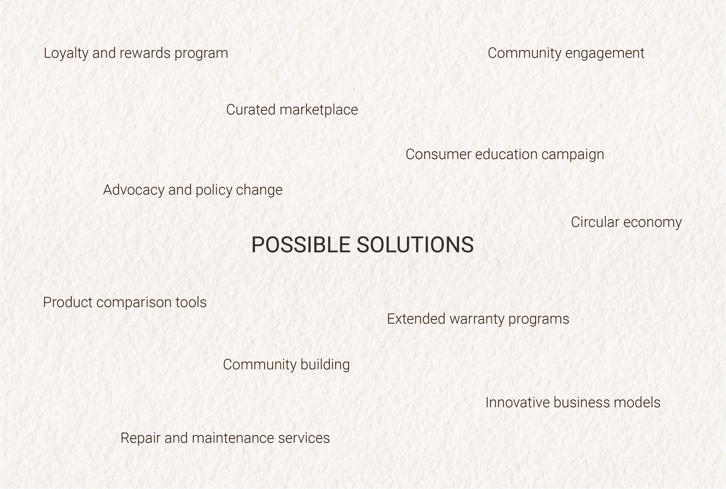
Endure was created with a commitment to quality in contrast, today's consumer culture often favors disposable, trend-driven products designed with planned obsolescence.
The company's mission is to make and promote high-quality, long-lasting products easily accessible to consumers, ensuring that every item in their catalog meets the highest standards. Endure not only prioritizes the longevity of the items they sell but also ensures that the companies they partner with honor their warranty policies. By filtering only the best products into their selection, Endure significantly cuts down the time consumers spend searching for high-quality items.


I created Endure as a comprehensive case study on planned obsolescence, consumerism culture, and strategies to counteract these trends. Endure's mission is to make and promote high-quality, long-lasting products easily accessible to consumers, ensuring that every item in the catalog meets the highest standards.
This project examines the detrimental effects of a throwaway culture, where low-quality, short-lived products dominate the market, leading to environmental harm and consumer dissatisfaction. By curating a selection of durable goods and partnering with companies that honor their warranty policies, Endure provides a sustainable alternative. The brand significantly reduces the time consumers spend searching for high-quality items and even features a cafe branch that promotes some of these top-tier products from partnered brands.
In a world full of limited resources, why not make the most of our materials?
Through this case study, I aim to highlight the importance of durability and sustainability in product design and marketing, offering a practical solution to combat planned obsolescence and foster a more conscientious consumer culture.


Logos
The main logo features a bold, industrial typeface in all caps. The "U" in the logo is slightly bent, symbolizing our belief that what is damaged or dented should not be discarded but embraced. This reflects ENDURE's ethos of sustainability, emphasizing that things are fixable and should be cherished rather than tossed aside. This logo embodies their commitment to combating planned obsolescence by promoting the longevity and durability of high-quality products.
The second logo represents their store branch, which offers a wide range of products, including clothing, lifestyle items, and home goods. This logo is inspired by an infinity knot, elegantly shaped like a baby pine tree. The infinity knot symbolizes the concept of continuity, longevity, and an endless cycle.
The baby pine tree represents growth, renewal, and their deep connection to nature. This logo aligns with ENDURE's philosophy by highlighting the timeless nature of well-crafted items and their dedication to eco-friendly practices. It signifies that, like the infinite and ever-growing pine tree, their products are designed to last and remain relevant through time.
The third logo is a variation of the second, featuring the same infinity knot baby pine tree, but placed within a mug. This logo represents the café branch, symbolizing the integration of their retail spaces with a warm, inviting cafe environment. The mug signifies a place where customers can socialize, experience our products firsthand, and connect with their community.


The Endure café is not just a place to grab a drink; it's a cornerstone of community building. Nestled within the retail space, the café serves as a gathering spot where individuals can experience the products Endure offers in their stores. The café proudly uses their partnered companies products proven to be high in quality and shares the experience with their customers allowing them to use the products first hand.
At the café, sustainability is a tangible commitment woven into everyday practices. One of the initiatives is the drink punch card program, designed to reward customers who choose to bring their own cups. By implementing the drink punch card program, it not only promotes environmental stewardship but also empowers customers to actively participate in sustainable practices during their visits to the café. It's a small gesture with a significant impact, reinforcing ENDURE's mission to integrate sustainability into every aspect of their business model.
The simplicity is the ultimate form of sophistication. The turquoise is their signature color, symbolizing clarity, calm, and trust. This is complemented by accents of yellow, adding a touch of warmth and vibrancy to the spaces.


The website is designed with simplicity and user-friendliness in mind, providing an effortless browsing experience for those seeking sustainable products. The platform highlights their partnered brands and showcases the latest sustainable drops, ensuring that their customers have access to the best eco-friendly options available.
The design prioritizes making it easy for users to find high-quality, sustainable items without the need to scour the internet or visit multiple websites. With intuitive navigation and well-organized categories, customers can quickly discover a wide range of products, from clothing and lifestyle items to home goods and more. Each product page features detailed information about the item’s sustainability credentials and the brand’s commitment to eco-friendly practices.